developed and iterated through a design science research approach
With each version came new learning, more feedback and improved designs
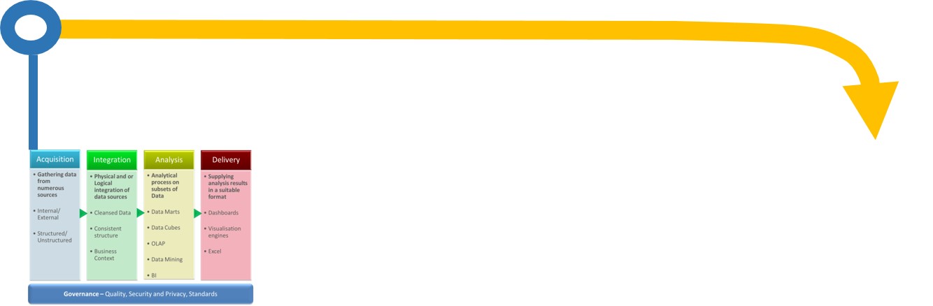
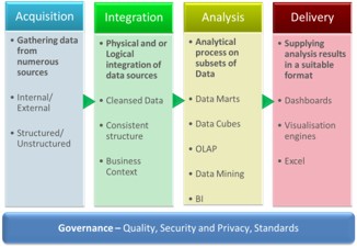
The first version of the Data Value map (DVM) was created in 2013, when we first observed the difficult people had in describing their utilisation of data. In an attempt to put a visual perspective on the issue, the DVM was designed to be a very simple tool to enable data conversations. The focus of these conversations were mainly around the problems or pain points that organisations were experiencing while trying to derive value from their data. From its early use, it was clear to see the dominance of technology in the way people think and talk about data. It became very evident that for the DVM to be effective the need to take technology out of the conversation was essential. However, this version did have a lot of impact in its own right. This simple version was used in our maturity analysis of agile analytics in organisations. Helping to frame the questions a global survey, the results highlight significant issues in integration and governance in organisations. In particular, 80% of organisations did not have a single version of the truth, along with a very low rate of governance implementation.
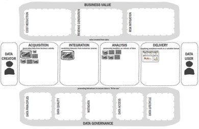
One of the biggest differences of version 2 is the addition of the value component at the end of DVM. The value of data is always implied but difficult to make explicit. The added value section provides an explicit focus on value and a space to detail it. The definitions of the components were also updated to emphasis the data aspect of any conversation or collaboration. With more knowledge of how best to use the DVM, a work-in-progress paper was written to guide users in the specific task of planning a data project (click here for the paper). The paper provides examples of its use (visualised) and the shared understanding it built. As part of the paper, a number of questions are detailed to again help its users put data as the primary focus.
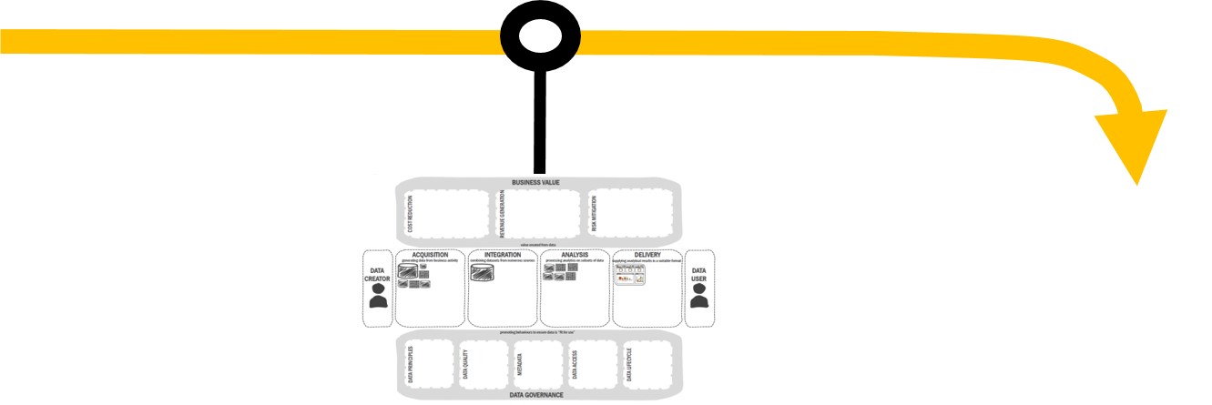
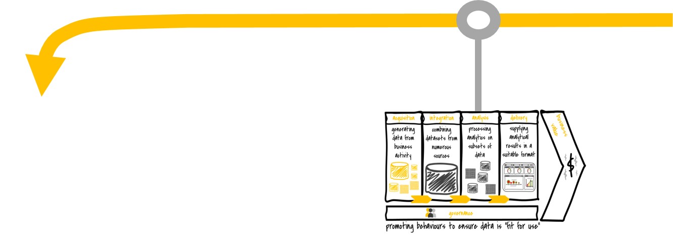
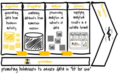
Version 3 of DVM continued to incorporate feedback from its use in a wide range of data initiatives and organisations. The first change was to bring value to the top of the DVM and also include the data creator and data user. This was to signify that value from data can be derived an every stage and not just an output from delivery. The inclusion of the data creator and data user icons, signify the key purpose of the DVM, which is to create a shared understanding between these two types of stakeholders. This was also validated in the evaluations, which found that building a shared understanding was indeed its most effective function. Version 3 also explored more explicit prompts for business value and governance for users to further detail these aspects of their data initiatives. The insights gained from using and building the DVM were published in the European Conference of Information Systems (click here for the paper). Some of the key contributions were the description of the barriers in building a shared understanding around data initiatives.
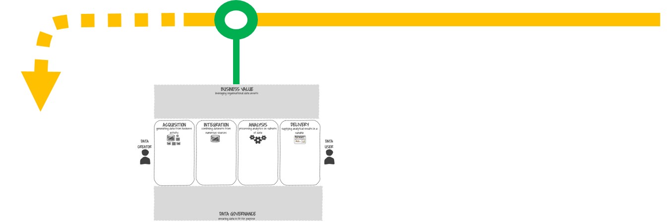
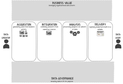
The latest version of the DVM comes in two flavours (see templates page for the two versions). The first version is a simplified template that provides more space for multiple and for building a shared mental model of data in general. The second version provides more detail prompts for users to do create a more detailed visualisation and enable a multitude of conversations. Above all, the more the DVM is used the more insight is gained into how shared understanding is built and its necessity in the success of data projects. The exciting part is there is plenty of more to come.